Notifications

Article
Mood. What is it and how can I get some?
Published 6 years ago
1.3 K
9
2
Important tips for achieving cohesive art style that reinforces gameplay:
Mood is perhaps the most difficult aspect of a game to quantify. You can ~feel~ it, and you know when it's not there, but how do you explain to a game developer what it is?
And more importantly: How can you achieve it?
Many indie developers suffer from a lack of mood in their games simply because art is not the focus. Obviously, it doesn't matter how great the art is if the gameplay isn't fun or is buggy. Also, for many solo indie developers hiring on a dedicated artist simply isn't an option for budget reasons, so how can you get around this problem?
Remember a few key points and your mood will be boosted instantly! (Pun intended?)
- Cohesive Medium
- Cohesive Shapes
- Cohesive Palette
- Cohesive Gameplay
Now some of you out there might be sensing a pattern. The best way to describe Mood in a game, is whether or not the player says things like "Huh. Strange design choice." or "That didn't make any sense." Essentially, every time the player becomes aware they are playing a game and immersion is broken. You DON'T want the player to be aware they're playing a game. They should be living it. They should be feeling emotions from it and they should be having fun. Every time the player encounters a design decision that is not cohesive, immersion will break.
Cohesive Medium:
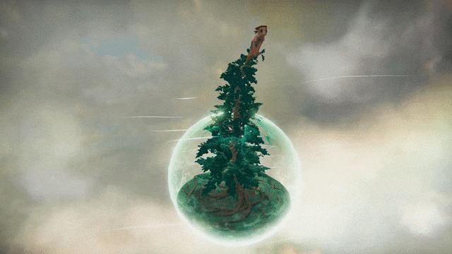
Basically, if you're doing pixel art stick with pixel art. If your goal is a painterly look, be painterly. If it's lowpoly, be lowpoly. If your goal is AAA-quality then... well then you should probably hire about 200 professional artists. So maybe don't start with that.
In the Ludum Dare 41 game Woodsy by Braindeer Games, you play as a human wandering around a village inhabited by monsters. It's a super cute, short game with memorable moments which I'd highly recommend.
However, one thing that threw me off was the fact that all the characters are rendered as flat planes of pixel art that rotate to face you in an otherwise 3D world which did tend to damage the mood for me by reminding me I was playing a game every time a character clipped into the environment.
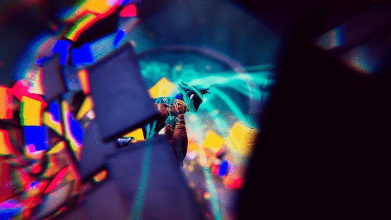
An example of discordant mediums being used to purposefully create discordance can be seen here:
Here the mediums of drawn animation and collage are being used together to imply that what is happening is unnatural and alarming, emphasizing the tones in the story. It puts you on edge.
I'd be curious to see if this tactic could be used in games!
Cohesive Shapes:
A perfect example of this is Minecraft.
The art style is completely cohesive. Everything is a cube. Despite it's simplicity, it's very aesthetically pleasing to the point where you find yourself looking out over gorgeous vistas of squares and thinking to yourself: How did my life come to this? Now, what if you came across a creature that was made out of spheres in the Minecraft universe? Instant immersion break. The player is immediately aware that something is wrong and that they are playing an artificial construct instead of a cohesive whole.
As an exercise in mood, you could for example try to create a game out of only simple shapes like cubes, spheres and triangles. You'd be surprised how far a solid understanding of the fundamentals will take you!
For more guidance on this, please check out this GDC Talk: Level Design Workshop: Blockmesh and Lighting Tips.
Cohesive Palette:
Basically anything by 'That Game Company' is an incredible example of this, though I'll reference Journey in particular since it's their most mainstream game.
It's important to consider the color palette for individual areas as well as for the game as a whole as is shown to the left with the Color Script for Journey.
Color theory can be a bit confusing to start with, but you can begin by creating scenes using only pre-made palettes of 3-5 colors using only Complimentary and Analogous hues. Keep it simple!
Yes that is a very big color wheel. It is very big because it is very important. There is a lot of information there, but the important things to remember are that colors go well with their immediate neighbors but also with the color on the exact opposite side of the wheel.
These palettes are the two most popular palettes on the site: https://www.colourlovers.com which is a great place to start getting color ideas for your game. Note how both contain variations on a color (Analagous) and then variations on the (Complementary) opposite side.
Cohesive Gameplay:
This one is perhaps the most difficult to achieve, since it depends entirely on the game you are trying to create. Is your game story-based? Action-based? Is it relaxed or tense? Happy or Sad? What is the point you are trying to make with your game? What are you trying to say? All of these are important when considering how to approach your mood.
For this example I will use Undertale, a game about deciding whether to kill or spare the monsters who attack you.
The game is done in a very retro, simplistic style mimicking early RPGs such as Earthbound. This is done to invoke the mentality of someone playing an RPG: "Kill all monsters. Grind EXP. Kill stronger Monsters. Repeat." The colors are kept to an extremely limited, retro palette and the medium is pixel art. Everything aligns to create an extremely successful game with a powerful sense of Mood.
The best part about this example is that the art is extremely simple compared to most games, due to the fact that the creator Toby Fox has admitted he is not an Artist, and that he needed to create a simple style that would play to his strengths.
Overall,
These 4 core principles can hopefully help you introduce some Mood to your game, no matter where you are on your gamedev journey. It's never too late to start practicing these core principles and seeing for yourself how they interact with one another. I hope this was helpful to you and thanks so much for reading!
~ Rebecca Harrison